
Why your popup conversion rate might not mean what you think it means
Most marketers are not critical enough about their popup's conversion rate. We dive into how the opt-in rate can be manipulated.

Every popup tool reports its own grade. Here’s how to check the math, including ours.
Let’s get the conflict of interest out of the way in the first paragraph.
Kluvos sells popups. For many of our users, we get real, substantial improvements in opt-in rates. For others, we save them hundreds of dollars per month vs going with an alternative. But, before we get too focused on the opt-in rate, it’s worth pointing out that opt-in rate is only one thing to consider when evaluating popup performance. We’ll direct you to our previous works to dive into that topic in The Pop-Up Strategy You’ve Been Missing. The ensuing article dives into how operators often put too much emphasis on the opt-in number itself and don’t evaluate it critically.
This isn’t an argument against popup providers. Use one. Get a free trial, get a custom design, collect some zero-party data while you’re at it. Just don’t take the dashboard at face value, because the dashboard was built with (slightly) mis-aligned incentives i.e. the provider wants the popup to seem productive, while the business owner wants it to actually be productive.
Let’s get into it.
The mistake: assuming two systems mean the same thing by the same word
Your popup provider reports an opt-in rate. Klaviyo reports list growth. Those two numbers should be roughly compatible. They are not the same measurement, and treating them as interchangeable is where operators get taken.
Opt-in rate, stated simply:
opt-in rate = submissions ÷ impressions
Both terms are defined by the vendor, and neither is standardized across the category.
Even when everyone involved is being completely honest, the numbers will diverge because the systems may use different deduplication rules, bot filters, consent handling, time-zone boundaries, or attribution windows. Two honest systems measuring the same week will disagree. That’s normal, and it’s not the problem.
The problem is that the same slack that produces honest disagreement also produces cover for dishonest ones.
The scenario
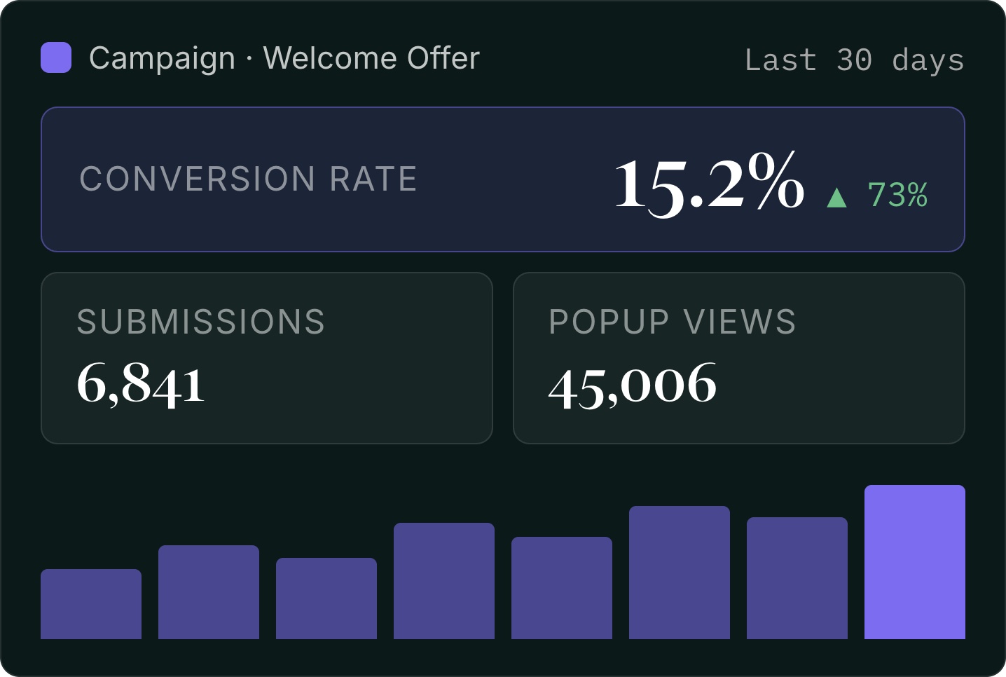
Your Klaviyo-native popup was converting at 3%. You sign up with a new provider. The design looks better, the animation is polished, and the provider promises a much higher rate. Two weeks in, their dashboard says 15%.
Five times better. Congratulations.
Now go check.
The cross-check
Connect the new popup to the same Klaviyo list your old popup was feeding. This is one of the most useful setup decisions you can make when trialing a provider. That gives you one continuous chart, allowing you to easily measure the performance impact of the new popup vs the old.
Then open that list’s growth report in Klaviyo and look at net membership change over time.
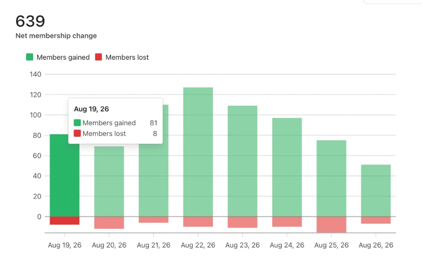
Here’s what to check. If your traffic is roughly flat and your opt-in rate went from 3% to 15%, you should see something in the neighborhood of a 5x increase in new members gained. That’s the claim your vendor is making, restated in a unit you can verify.
If members gained is flat, you have a problem. That’s not a rounding discrepancy. It’s a flat line where a 5x increase should be.
If submissions climbed and net new profiles didn’t, the popup is busy, not productive.
One mechanical detail that makes this cross-check work: someone who is already on the list doesn’t become a new member by submitting again. They’re already there. Klaviyo’s list growth report tracks membership changes, so a resubmission from an existing subscriber doesn’t move the line. That’s what makes the cross-check useful, and how you can get an honest assessment of opt-in performance.
Three reasons the two numbers disagree
Ranked from most innocent to least.
1. Genuine reconciliation differences
Deduplication rules, bot filtering, consent handling, time zones, attribution logic. Different systems make different decisions about how to handle each of those. Those differences usually produce a minimal gap, not 5x. If your two numbers are close but not identical, this is almost certainly all that’s happening. Move on.
2. The metric got redefined
Look again at that formula. Submissions on top, impressions on the bottom. Both are vendor-defined, and the exact definitions may not be obvious from the dashboard.
Small changes to what counts as a “view” or a “submission” can materially change the headline rate.
3. The audience got reshaped
This is the one worth watching closely.
One way to inflate a popup’s apparent performance is to show it to people who have already subscribed.
Someone who has already subscribed is more likely to submit again than a first-time visitor. Show the new popup preferentially to known and returning visitors, or stop suppressing existing subscribers, and the opt-in rate can rise without a single additional person joining your list. The numerator can then include people who were already on your list.
Your dashboard looks incredible. Your list doesn’t grow. And because those submissions are existing profiles, Klaviyo’s growth chart stays flat while the vendor’s chart goes vertical.
The decay tell
Cross-checking against Klaviyo can help reveal this. There’s also a pattern worth watching in the vendor’s own dashboard, even if you never run the Klaviyo cross-check.
Watch the shape of the curve over eight weeks.
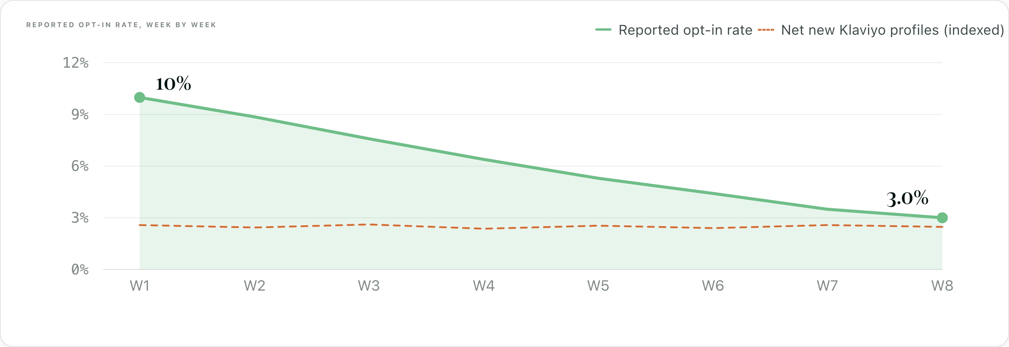
If the number is being inflated by people who were already willing to subscribe, that pool is finite and eventually gets exhausted. The first couple of weeks can look unusually strong before the rate begins to fall. By the eight-week mark, the decline may be much easier to see even if nothing about the popup itself has changed.
That pattern is worth investigating. If the design, targeting, and traffic mix haven’t changed, a sustained decline needs an explanation. One possibility is that the initial pool of existing subscribers has been exhausted.
Normal popup performance fluctuates. Traffic mix, seasonality, and campaigns all affect performance. A stable popup over a longer period tends to look more like a noisy range than a steady decline from an unusually high launch rate. A steep decline from a high launch number, with no design or targeting changes to explain it, has a short list of possible causes.
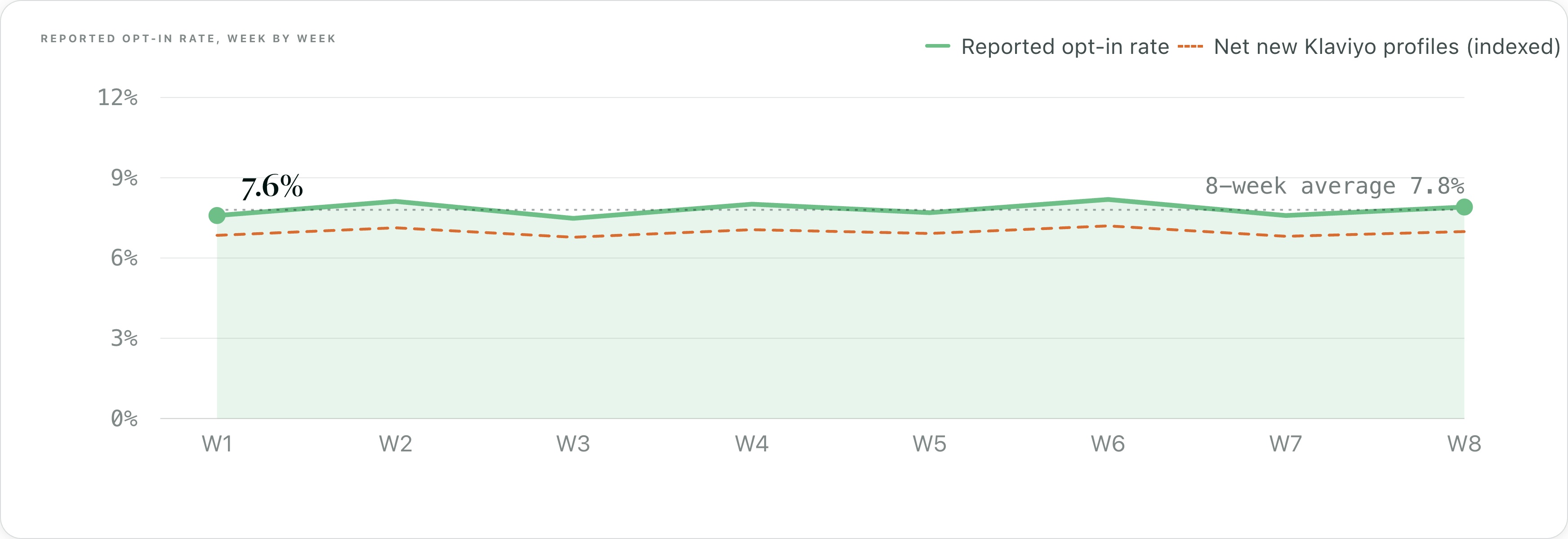
Run this check at three weeks and again at eight. The three-week point can fall near the decision to continue with a provider, which is why it’s worth watching the trend beyond it.
The checklist
Whoever you’re evaluating, including us:
- Use one list. Point the new popup at the same Klaviyo list the old one fed.
- Do the arithmetic before you look. If they claim 3% → 15%, calculate how many new members that should produce based on your traffic. Then compare that number with your actual list growth.
- Ask who sees the popup. Specifically, are existing subscribers suppressed, and how is that determined? If there’s an option, explicitly set your popup to “Do not show to existing Klaviyo subscribers.”
- Watch eight weeks, not two. Watch for the spike-then-decay pattern.
Try the pop-up. Take the free trial. Just make them prove it in a system they don’t control.